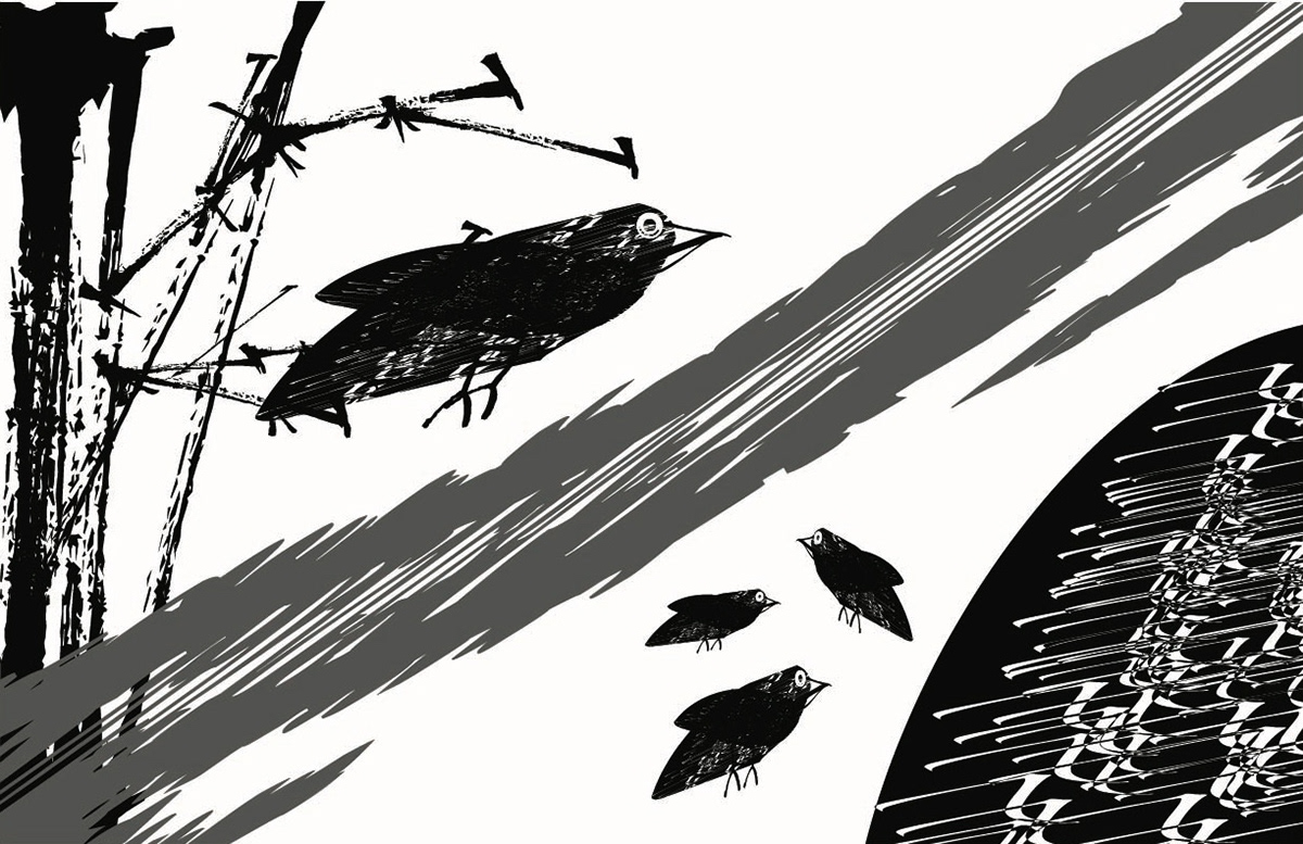
Typographic composition inspired by Wallace Stevens’ Thirteen Ways of Looking at a Blackbird, using text, spacing, and rhythm to express shifting viewpoints and poetic tone. Designed as a visual reading experience rather than a traditional layout, created using Adobe tools.
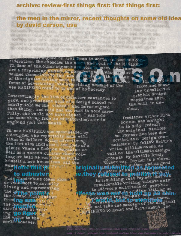
Typographic layout study inspired by David Carson, exploring distressed texture, irregular hierarchy, and intentionally broken grid structure. This piece focuses on how legibility, noise, and texture can be balanced to create a specific emotional tone.
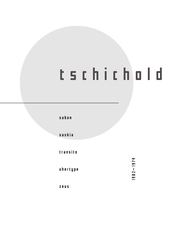
Poster design inspired by Jan Tschichold’s typographic principles, emphasizing balance, hierarchy, and negative space. This study focuses on clean alignment, careful type pairing, and controlled use of shape to create a clear focal point.
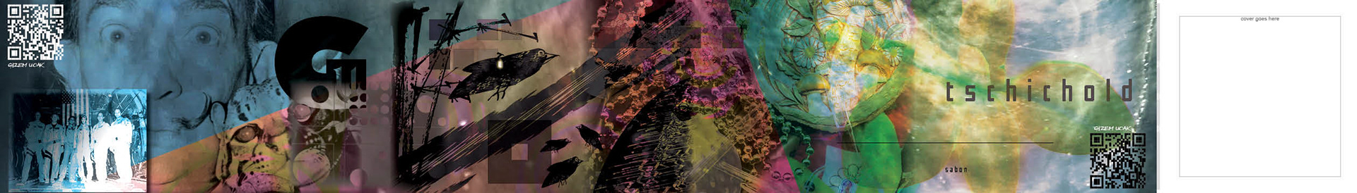
Digital collage blending previously done work with texture overlays, and experimental color composition. This piece focuses on depth and atmosphere, using layered imagery and color shifts to create a dreamlike, slightly unsettling mood.
Concept-driven motion piece exploring religion, corruption, and emotional response through a “Heaven to Hell” elevator narrative. Developed from a 100+ word mind map and composed using synchronized audio, timing, and sequential imagery to control emotional pacing.